Voting Results
6 months ago
– Sun, Apr 19, 2026 at 12:13:20 PM
Hello everyone,
Thank you all so much for taking part in the vote regarding The Magician card and the font choice. Your feedback means a lot to me, and I always truly appreciate hearing your thoughts.
After carefully reviewing all the responses, I decided to include two versions of The Magician in the deck. Opinions were genuinely divided, and I did not want to choose only one version when both connected with people in different ways. This way, everyone will have the chance to keep the version that feels closest to them.
As for the font, the comments about readability were absolutely fair. It is especially important for me to consider those who have physical limitations related to reading smaller or decorative text. Because of that, I decided to keep the main font. It will be clearly visible on the cards, since the text will be printed in gold foil while the cards themselves are fully matte. Even though I personally love the more authorial and gothic version, I believe it is important to listen to the majority and make the deck as comfortable and accessible as possible. Closer to the end of the campaign, I think I will hold one more vote – this time for the Claro deck.
Thank you for your votes, your sincerity, and your support.
Warmly, Una
We’re Funded! ✨ – Now Vote for the Final Design
6 months ago
– Wed, Apr 15, 2026 at 09:36:14 AM
Hello, friends!
We reached 100% funded in the first hour and 200% by the end of the first day. Thank you for your support, attention, and trust. For an independent project, this is a very meaningful start.
As promised, we have a few important updates.
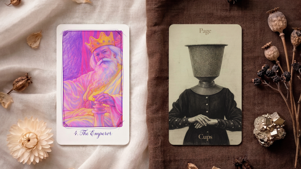
First – a shared choice for elements of the final version of the deck. I’d love to show you several versions of one of the cards, as well as two different directions for the typeface that will be used throughout the project.
Please share your thoughts on which card resonates with you more and which one you would like to see in the deck.
Right now, I’m choosing between a more classic style and the custom font I created for Secret Garden – more gothic in character and closer to the darker aesthetic of the deck. I’d truly love to know which option speaks to you more.
P.S. In the next update, I’ll share one of the Claro cards together with its drawing process.
Thank you for being here and for supporting independent art.
Warmly, Una